" width="49.217008024144334px"><path d="M 0 0 L 49.217 0 L 49.217 50.043 L 0 50.043 Z" fill="transparent" height="50.043px" id="adFv6KWg1" transform="translate(0 0)" width="49.217px"/><path d="M 43.67 9.17 C 40.405 4.665 35.627 1.948 30.181 0.743 C 18.483 -1.847 5.893 2.543 1.539 10.723 C -0.36 14.29 -0.507 18.225 1.128 21.813 C 3.174 26.313 7.738 29.79 13.784 31.53 C 13.671 37.882 15.629 43.303 19.294 46.597 C 22.214 49.221 25.984 50.227 29.912 49.433 C 32.392 48.933 34.779 47.748 36.959 46.046 C 46.944 38.243 51.394 21.681 44.574 10.52 C 44.292 10.058 43.992 9.607 43.674 9.17 Z M 38.729 13.662 C 39.51 15.381 39.435 17.147 38.497 18.905 C 35.993 23.608 28.53 26.521 21.004 26.13 C 22.302 20.87 25.172 16.132 28.593 13.458 C 29.976 12.375 31.45 11.632 32.946 11.331 C 34.884 10.941 36.577 11.377 37.981 12.638 C 38.141 12.778 38.291 12.931 38.439 13.088 C 38.544 13.275 38.645 13.466 38.733 13.661 L 38.729 13.661 Z M 7.023 19.073 C 6.242 17.354 6.317 15.588 7.254 13.83 C 7.894 12.625 8.86 11.542 10.07 10.595 C 14.016 7.513 20.55 5.959 26.815 6.805 C 21.109 10.15 16.445 17.023 14.612 24.932 C 10.922 23.675 8.162 21.574 7.027 19.078 Z M 28.64 43.006 C 26.703 43.396 25.01 42.959 23.606 41.698 C 21.572 39.873 20.391 36.587 20.278 32.66 C 27.598 33.148 34.788 31.114 39.662 27.302 C 40.133 26.932 40.578 26.551 41.007 26.152 C 39.667 34.383 34.305 41.864 28.644 43.006 Z" fill="rgb(46, 179, 106)" height="49.697241692996px" id="ZKDTK1von" transform="translate(0 0)" width="47.8500009356955px"/></g><g d="M 12.358 10.861 C 8.37 10.861 4.961 12.357 2.744 15.073 C 0.302 18.08 -0.552 22.285 0.352 26.925 C 1.651 33.603 6.041 37.16 13.049 37.209 C 16.169 37.209 18.759 36.782 20.764 35.941 L 20.82 35.919 L 20.722 30.709 L 20.602 30.767 C 18.35 31.75 16.332 32.171 13.868 32.171 C 10.501 32.171 8.299 30.596 7.643 27.738 C 14.023 27.923 18.597 26.598 20.877 23.888 C 22.274 22.228 22.74 20.133 22.26 17.653 C 21.406 13.277 17.898 10.868 12.365 10.868 L 12.358 10.86 Z M 15.421 21.351 C 14.2 22.877 11.278 23.718 6.979 23.796 C 6.895 21.459 7.615 19.299 8.969 17.859 C 10.043 16.726 11.469 16.099 12.972 16.099 C 14.68 16.099 15.703 16.926 16.021 18.551 C 16.233 19.641 16.035 20.581 15.421 21.345 L 15.421 21.352 Z M 48.157 11.952 L 48.086 11.937 C 44.494 11.253 40.866 10.868 38.12 10.868 C 33.758 10.89 30.208 12.436 27.85 15.337 C 25.204 18.601 24.322 23.334 25.359 28.679 C 26.439 34.217 29.283 37.26 33.37 37.26 C 36.673 37.26 39.362 35.941 41.17 33.44 L 41.268 46.889 L 48.39 46.889 L 48.15 12.03 L 48.15 11.959 Z M 32.523 27.817 C 31.782 24.004 32.375 20.447 34.111 18.317 C 35.261 16.905 36.885 16.157 38.798 16.157 C 39.511 16.157 40.125 16.192 41.085 16.385 L 41.12 23.947 C 41.148 26.498 40.287 28.914 38.819 30.418 C 37.852 31.402 36.716 31.922 35.529 31.922 C 34.089 31.922 33.045 30.504 32.523 27.817 Z M 75.98 11.545 L 68.858 11.545 L 68.929 23.697 C 68.915 28.529 66.656 31.779 63.303 31.779 C 62.195 31.779 61.384 31.394 61.024 29.519 C 60.897 28.857 60.826 27.987 60.819 26.861 L 60.706 11.552 L 53.584 11.552 L 53.69 28.422 C 53.679 29.373 53.759 30.323 53.93 31.259 C 54.692 35.186 57.113 37.267 60.925 37.267 C 64.736 37.267 67.743 35.82 69.853 32.841 L 69.882 32.841 L 70.354 36.583 L 76.17 36.583 L 75.994 11.645 L 75.994 11.552 Z M 88.875 11.545 L 81.753 11.545 L 81.923 36.483 L 81.93 36.576 L 89.052 36.576 L 88.875 11.638 Z M 109.167 31.095 C 108.218 31.404 107.228 31.567 106.231 31.58 C 104.735 31.58 103.803 30.724 103.478 29.028 C 103.384 28.52 103.334 28.005 103.33 27.488 L 103.238 16.734 L 108.885 16.734 L 108.843 11.631 L 108.843 11.538 L 103.196 11.538 L 103.14 4.033 L 96.025 5.181 L 96.074 11.538 L 91.621 11.538 L 91.621 16.727 L 96.067 16.727 L 96.138 27.917 C 96.159 29.085 96.265 30.169 96.455 31.145 C 97.246 35.2 99.73 37.003 104.509 37.003 C 106.358 37.003 107.869 36.783 109.273 36.319 L 109.337 36.298 L 109.28 31.052 L 109.16 31.088 Z M 125.436 22.399 C 125.048 23.611 124.702 24.901 124.258 26.54 L 123.919 27.787 L 123.898 27.787 C 123.418 26.347 122.818 24.595 121.985 22.449 L 117.856 11.609 L 117.835 11.552 L 110.169 11.552 L 120.531 34.843 C 118.505 40.652 116.43 41.807 113.31 41.899 L 113.226 41.899 L 113.261 47.487 L 113.261 47.58 L 113.353 47.58 C 121.081 47.387 123.968 44.992 127.398 35.948 L 136.659 11.559 L 129.001 11.559 L 125.436 22.414 Z M 154.008 10.96 C 150.782 10.96 148.234 12.193 146.216 14.73 C 146.244 14.175 146.265 13.619 146.23 13.191 L 146.131 0.605 L 139.009 0.605 L 139.27 35.563 L 139.27 35.627 L 139.334 35.649 C 142.976 36.775 145.976 37.259 149.364 37.259 C 153.796 37.259 157.389 35.734 159.739 32.848 C 162.393 29.591 163.261 24.766 162.188 19.256 C 161.13 13.833 158.306 10.967 154.022 10.967 Z M 155.045 20.311 C 155.787 24.117 155.165 27.688 153.387 29.876 C 152.272 31.251 150.747 31.971 148.982 31.971 C 148.206 31.971 147.14 31.843 146.364 31.651 L 146.343 24.424 C 146.3 21.758 147.169 19.256 148.658 17.731 C 149.604 16.761 150.726 16.249 151.898 16.249 C 153.464 16.249 154.523 17.617 155.045 20.311 Z M 177.745 10.861 C 173.757 10.861 170.348 12.357 168.131 15.073 C 165.682 18.08 164.828 22.285 165.732 26.918 C 167.03 33.596 171.42 37.152 178.429 37.202 C 181.549 37.202 184.139 36.775 186.144 35.934 L 186.2 35.912 L 186.101 30.702 L 185.981 30.759 C 183.73 31.743 181.711 32.163 179.248 32.163 C 175.881 32.163 173.679 30.588 173.023 27.73 C 179.41 27.916 183.977 26.59 186.257 23.882 C 187.654 22.222 188.12 20.126 187.64 17.646 C 186.786 13.269 183.278 10.86 177.745 10.86 Z M 180.808 21.351 C 179.587 22.877 176.665 23.718 172.366 23.796 C 172.282 21.459 173.001 19.299 174.357 17.859 C 175.429 16.726 176.855 16.099 178.359 16.099 C 180.06 16.099 181.09 16.926 181.408 18.551 C 181.619 19.641 181.422 20.581 180.808 21.345 L 180.808 21.352 Z M 211.066 23.882 C 212.464 22.222 212.929 20.126 212.449 17.646 C 211.595 13.269 208.087 10.86 202.554 10.86 C 198.566 10.86 195.157 12.357 192.941 15.073 C 190.491 18.08 189.637 22.285 190.541 26.918 C 191.84 33.596 196.23 37.152 203.238 37.202 C 206.358 37.202 208.949 36.775 210.953 35.934 L 211.01 35.912 L 210.911 30.702 L 210.791 30.759 C 208.539 31.743 206.521 32.163 204.057 32.163 C 200.69 32.163 198.488 30.588 197.832 27.73 C 204.213 27.916 208.786 26.59 211.066 23.882 Z M 205.617 21.359 C 204.396 22.884 201.474 23.725 197.176 23.803 C 197.091 21.466 197.811 19.306 199.166 17.866 C 200.239 16.733 201.665 16.106 203.168 16.106 C 204.869 16.106 205.899 16.933 206.217 18.558 C 206.429 19.648 206.231 20.589 205.617 21.352 Z M 85.402 8.88 C 87.831 8.88 89.8 6.892 89.8 4.44 C 89.8 1.987 87.831 0 85.402 0 C 82.974 0 81.005 1.987 81.005 4.44 C 81.005 6.892 82.974 8.88 85.402 8.88 Z" fill="transparent" height="47.58000004577639px" id="OYVnZoc1q" transform="translate(57.321 0)" width="212.6316473257364px"><path d="M 12.358 10.861 C 8.37 10.861 4.961 12.357 2.744 15.073 C 0.302 18.08 -0.552 22.285 0.352 26.925 C 1.651 33.603 6.041 37.16 13.049 37.209 C 16.169 37.209 18.759 36.782 20.764 35.941 L 20.82 35.919 L 20.722 30.709 L 20.602 30.767 C 18.35 31.75 16.332 32.171 13.868 32.171 C 10.501 32.171 8.299 30.596 7.643 27.738 C 14.023 27.923 18.597 26.598 20.877 23.888 C 22.274 22.228 22.74 20.133 22.26 17.653 C 21.406 13.277 17.898 10.868 12.365 10.868 L 12.358 10.86 Z M 15.421 21.351 C 14.2 22.877 11.278 23.718 6.979 23.796 C 6.895 21.459 7.615 19.299 8.969 17.859 C 10.043 16.726 11.469 16.099 12.972 16.099 C 14.68 16.099 15.703 16.926 16.021 18.551 C 16.233 19.641 16.035 20.581 15.421 21.345 L 15.421 21.352 Z M 48.157 11.952 L 48.086 11.937 C 44.494 11.253 40.866 10.868 38.12 10.868 C 33.758 10.89 30.208 12.436 27.85 15.337 C 25.204 18.601 24.322 23.334 25.359 28.679 C 26.439 34.217 29.283 37.26 33.37 37.26 C 36.673 37.26 39.362 35.941 41.17 33.44 L 41.268 46.889 L 48.39 46.889 L 48.15 12.03 L 48.15 11.959 Z M 32.523 27.817 C 31.782 24.004 32.375 20.447 34.111 18.317 C 35.261 16.905 36.885 16.157 38.798 16.157 C 39.511 16.157 40.125 16.192 41.085 16.385 L 41.12 23.947 C 41.148 26.498 40.287 28.914 38.819 30.418 C 37.852 31.402 36.716 31.922 35.529 31.922 C 34.089 31.922 33.045 30.504 32.523 27.817 Z M 75.98 11.545 L 68.858 11.545 L 68.929 23.697 C 68.915 28.529 66.656 31.779 63.303 31.779 C 62.195 31.779 61.384 31.394 61.024 29.519 C 60.897 28.857 60.826 27.987 60.819 26.861 L 60.706 11.552 L 53.584 11.552 L 53.69 28.422 C 53.679 29.373 53.759 30.323 53.93 31.259 C 54.692 35.186 57.113 37.267 60.925 37.267 C 64.736 37.267 67.743 35.82 69.853 32.841 L 69.882 32.841 L 70.354 36.583 L 76.17 36.583 L 75.994 11.645 L 75.994 11.552 Z M 88.875 11.545 L 81.753 11.545 L 81.923 36.483 L 81.93 36.576 L 89.052 36.576 L 88.875 11.638 Z M 109.167 31.095 C 108.218 31.404 107.228 31.567 106.231 31.58 C 104.735 31.58 103.803 30.724 103.478 29.028 C 103.384 28.52 103.334 28.005 103.33 27.488 L 103.238 16.734 L 108.885 16.734 L 108.843 11.631 L 108.843 11.538 L 103.196 11.538 L 103.14 4.033 L 96.025 5.181 L 96.074 11.538 L 91.621 11.538 L 91.621 16.727 L 96.067 16.727 L 96.138 27.917 C 96.159 29.085 96.265 30.169 96.455 31.145 C 97.246 35.2 99.73 37.003 104.509 37.003 C 106.358 37.003 107.869 36.783 109.273 36.319 L 109.337 36.298 L 109.28 31.052 L 109.16 31.088 Z M 125.436 22.399 C 125.048 23.611 124.702 24.901 124.258 26.54 L 123.919 27.787 L 123.898 27.787 C 123.418 26.347 122.818 24.595 121.985 22.449 L 117.856 11.609 L 117.835 11.552 L 110.169 11.552 L 120.531 34.843 C 118.505 40.652 116.43 41.807 113.31 41.899 L 113.226 41.899 L 113.261 47.487 L 113.261 47.58 L 113.353 47.58 C 121.081 47.387 123.968 44.992 127.398 35.948 L 136.659 11.559 L 129.001 11.559 L 125.436 22.414 Z M 154.008 10.96 C 150.782 10.96 148.234 12.193 146.216 14.73 C 146.244 14.175 146.265 13.619 146.23 13.191 L 146.131 0.605 L 139.009 0.605 L 139.27 35.563 L 139.27 35.627 L 139.334 35.649 C 142.976 36.775 145.976 37.259 149.364 37.259 C 153.796 37.259 157.389 35.734 159.739 32.848 C 162.393 29.591 163.261 24.766 162.188 19.256 C 161.13 13.833 158.306 10.967 154.022 10.967 Z M 155.045 20.311 C 155.787 24.117 155.165 27.688 153.387 29.876 C 152.272 31.251 150.747 31.971 148.982 31.971 C 148.206 31.971 147.14 31.843 146.364 31.651 L 146.343 24.424 C 146.3 21.758 147.169 19.256 148.658 17.731 C 149.604 16.761 150.726 16.249 151.898 16.249 C 153.464 16.249 154.523 17.617 155.045 20.311 Z M 177.745 10.861 C 173.757 10.861 170.348 12.357 168.131 15.073 C 165.682 18.08 164.828 22.285 165.732 26.918 C 167.03 33.596 171.42 37.152 178.429 37.202 C 181.549 37.202 184.139 36.775 186.144 35.934 L 186.2 35.912 L 186.101 30.702 L 185.981 30.759 C 183.73 31.743 181.711 32.163 179.248 32.163 C 175.881 32.163 173.679 30.588 173.023 27.73 C 179.41 27.916 183.977 26.59 186.257 23.882 C 187.654 22.222 188.12 20.126 187.64 17.646 C 186.786 13.269 183.278 10.86 177.745 10.86 Z M 180.808 21.351 C 179.587 22.877 176.665 23.718 172.366 23.796 C 172.282 21.459 173.001 19.299 174.357 17.859 C 175.429 16.726 176.855 16.099 178.359 16.099 C 180.06 16.099 181.09 16.926 181.408 18.551 C 181.619 19.641 181.422 20.581 180.808 21.345 L 180.808 21.352 Z M 211.066 23.882 C 212.464 22.222 212.929 20.126 212.449 17.646 C 211.595 13.269 208.087 10.86 202.554 10.86 C 198.566 10.86 195.157 12.357 192.941 15.073 C 190.491 18.08 189.637 22.285 190.541 26.918 C 191.84 33.596 196.23 37.152 203.238 37.202 C 206.358 37.202 208.949 36.775 210.953 35.934 L 211.01 35.912 L 210.911 30.702 L 210.791 30.759 C 208.539 31.743 206.521 32.163 204.057 32.163 C 200.69 32.163 198.488 30.588 197.832 27.73 C 204.213 27.916 208.786 26.59 211.066 23.882 Z M 205.617 21.359 C 204.396 22.884 201.474 23.725 197.176 23.803 C 197.091 21.466 197.811 19.306 199.166 17.866 C 200.239 16.733 201.665 16.106 203.168 16.106 C 204.869 16.106 205.899 16.933 206.217 18.558 C 206.429 19.648 206.231 20.589 205.617 21.352 Z M 85.402 8.88 C 87.831 8.88 89.8 6.892 89.8 4.44 C 89.8 1.987 87.831 0 85.402 0 C 82.974 0 81.005 1.987 81.005 4.44 C 81.005 6.892 82.974 8.88 85.402 8.88 Z" fill="rgb(0, 23, 77)" height="47.580000045776366px" id="IyLd97AM4" transform="translate(0 0)" width="212.63164732573637px"/></g></g></svg>)

Startup stock option financing platform
Equitybee
The Challenge
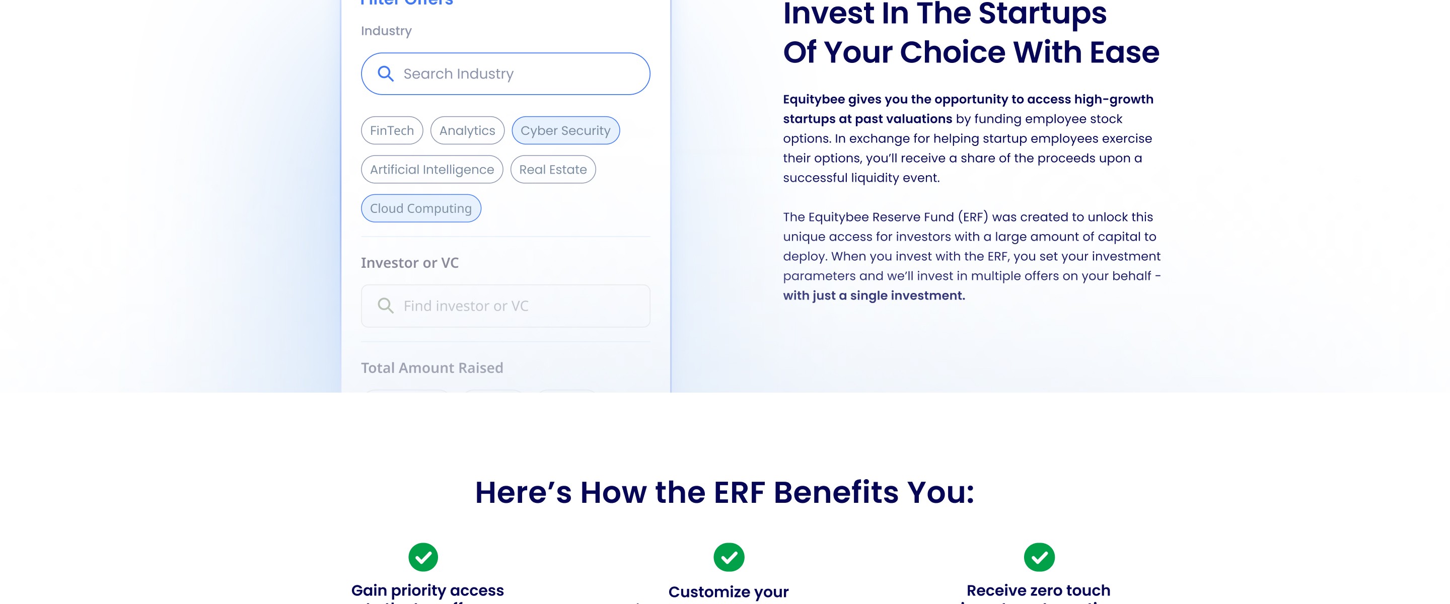
Equitybee served two very different audiences: startup employees seeking funding and accredited investors looking for access. The existing identity was recognizable but difficult to scale, relying heavily on neon green and a limited illustration system that struggled across different audiences, channels, and use cases.
The challenge was to create one brand that could feel approachable and human for employees, while remaining credible and structured for investors.
The Solution
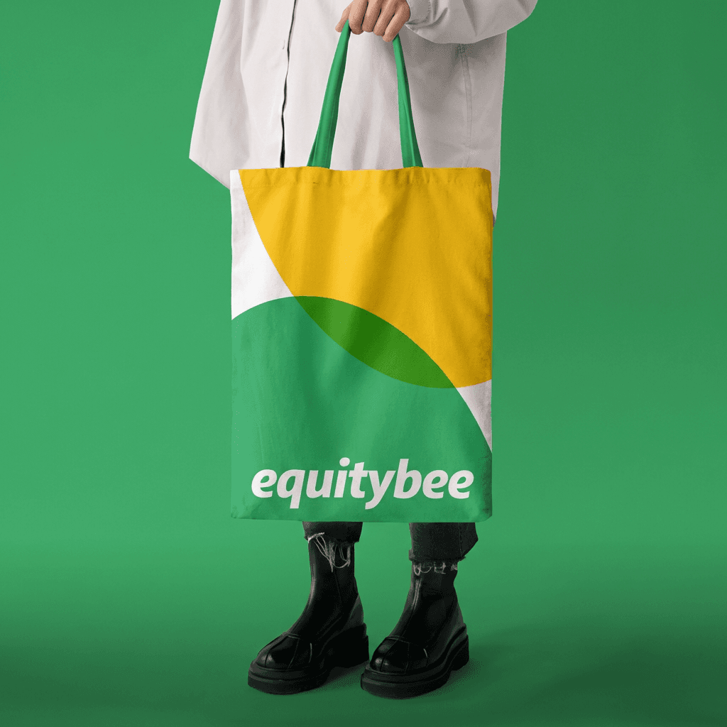
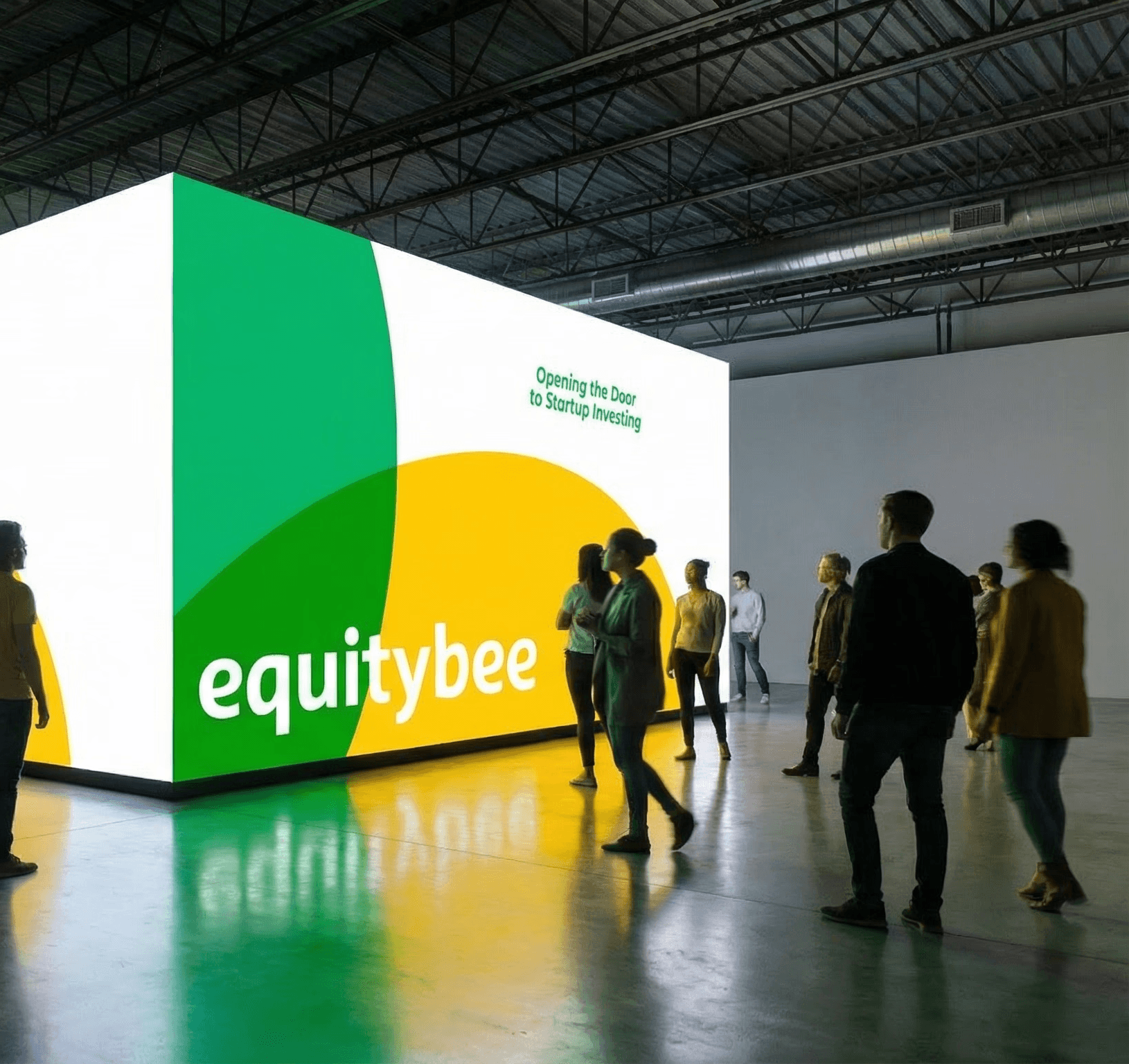
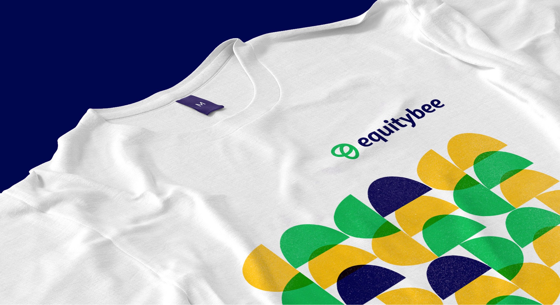
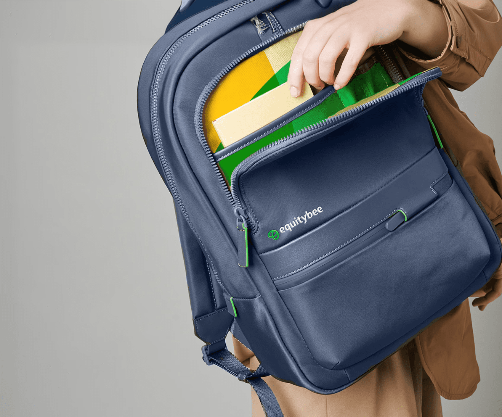
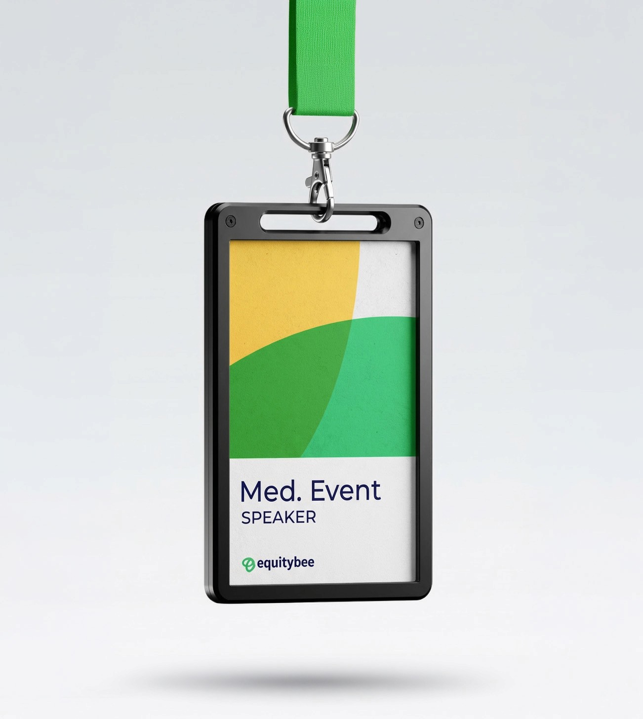
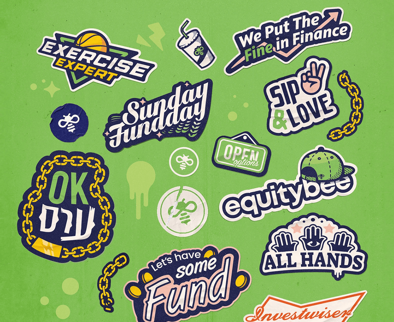
We evolved Equitybee into a more flexible visual system built to work across both audiences. The rebrand introduced a new logo, broader color palette, typography system, expressive illustration language, and modular graphic elements based on overlapping forms.
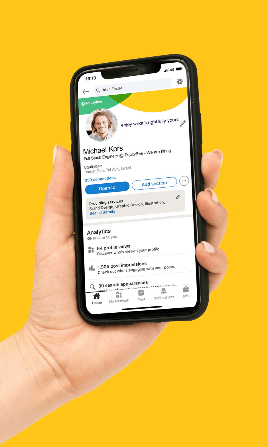
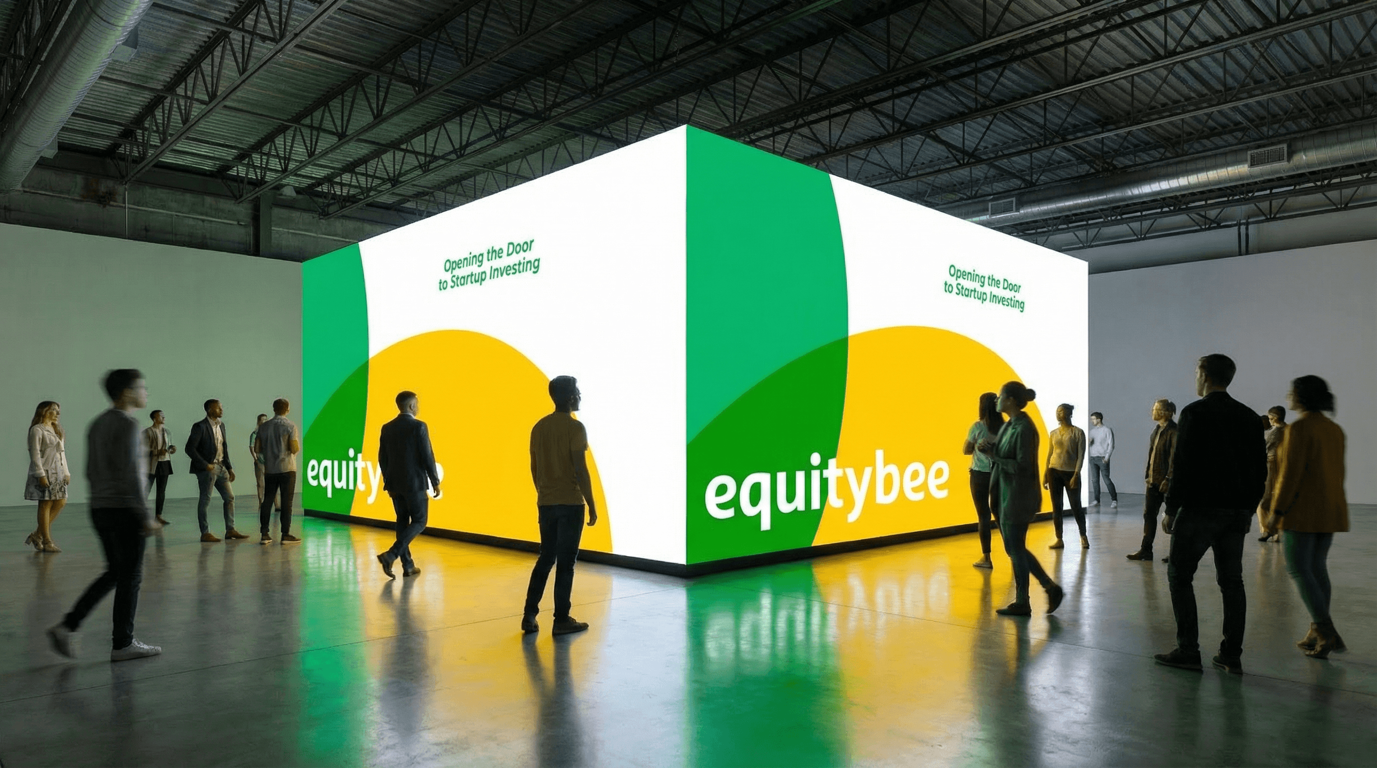
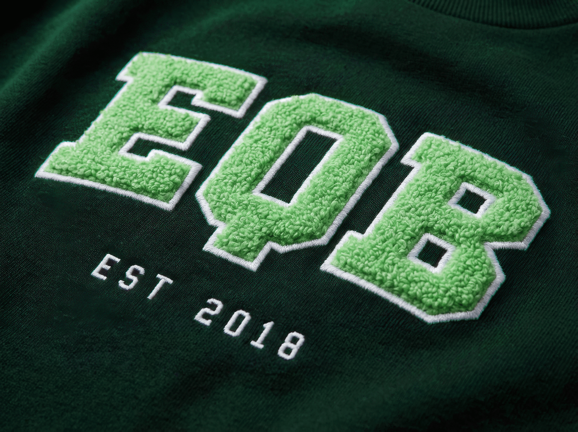
The system was designed to adapt across web, campaigns, presentations, product touchpoints, and physical applications without losing a consistent Equitybee identity.
My Role
I led the hands-on design and execution of the rebrand in collaboration with the Head of Creative, developing the identity across logo, color, typography, illustration, and visual systems.
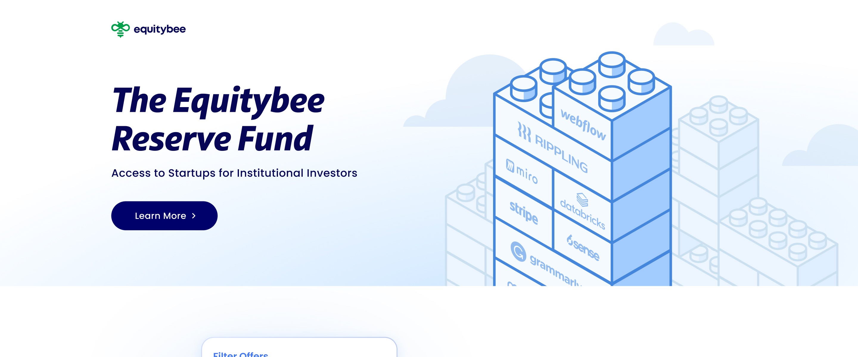
I also helped translate the new brand across the marketing website, campaigns, presentations, and product touchpoints, including co-designing and rebuilding the website in Webflow.
Deliverables:
Brand Identity
Visual System
Web Design
Illustration
Startup stock option financing platform
Equitybee
The Challenge
Equitybee served two very different audiences: startup employees seeking funding and accredited investors looking for access. The existing identity was recognizable but difficult to scale, relying heavily on neon green and a limited illustration system that struggled across different audiences, channels, and use cases.
The challenge was to create one brand that could feel approachable and human for employees, while remaining credible and structured for investors.
The Solution
We evolved Equitybee into a more flexible visual system built to work across both audiences. The rebrand introduced a new logo, broader color palette, typography system, expressive illustration language, and modular graphic elements based on overlapping forms.
The system was designed to adapt across web, campaigns, presentations, product touchpoints, and physical applications without losing a consistent Equitybee identity.
My Role
I led the hands-on design and execution of the rebrand in collaboration with the Head of Creative, developing the identity across logo, color, typography, illustration, and visual systems.
I also helped translate the new brand across the marketing website, campaigns, presentations, and product touchpoints, including co-designing and rebuilding the website in Webflow.
Deliverables:
Brand Identity
Visual System
Web Design
Illustration




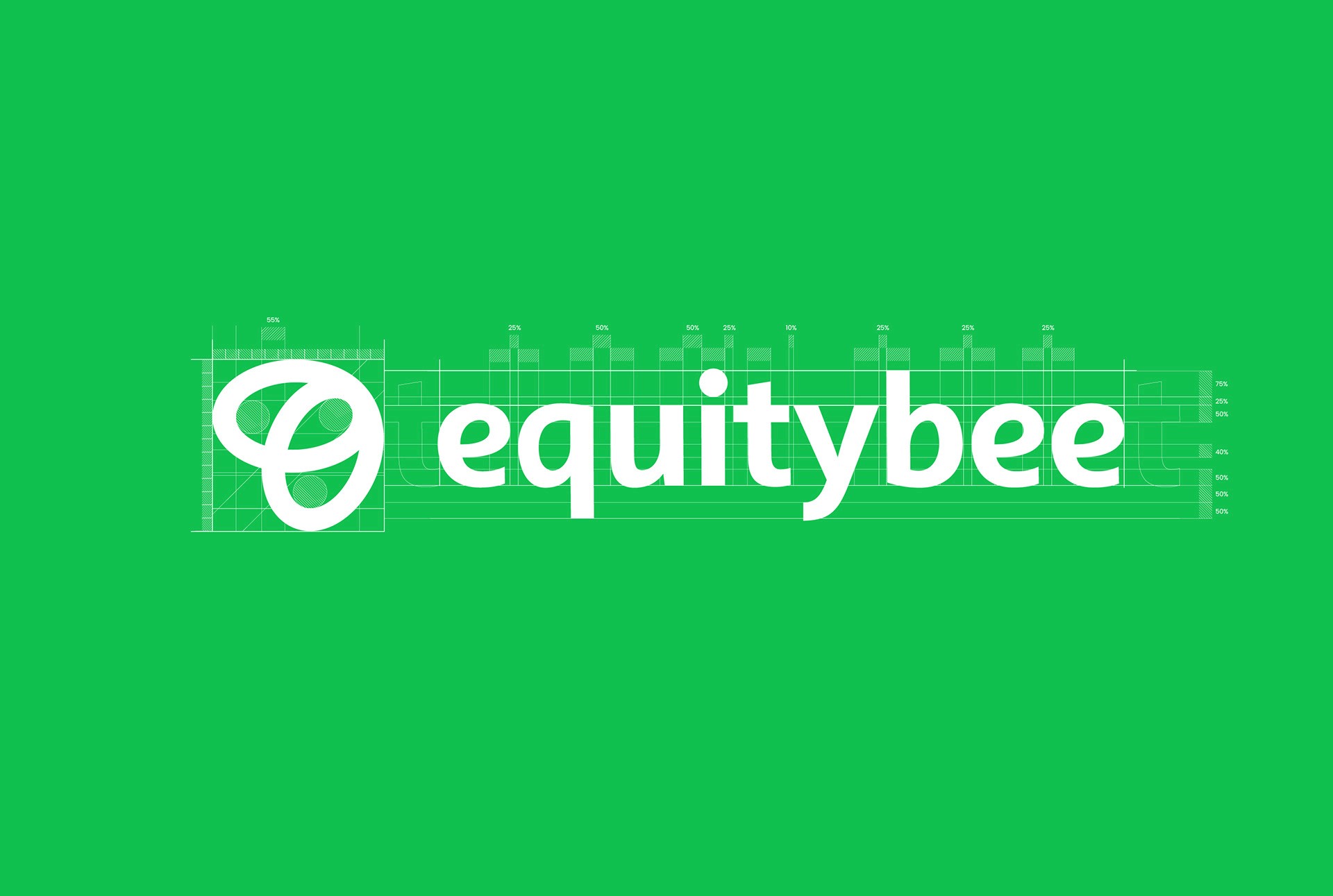
Logotype Construction
Logotype Construction
Identity
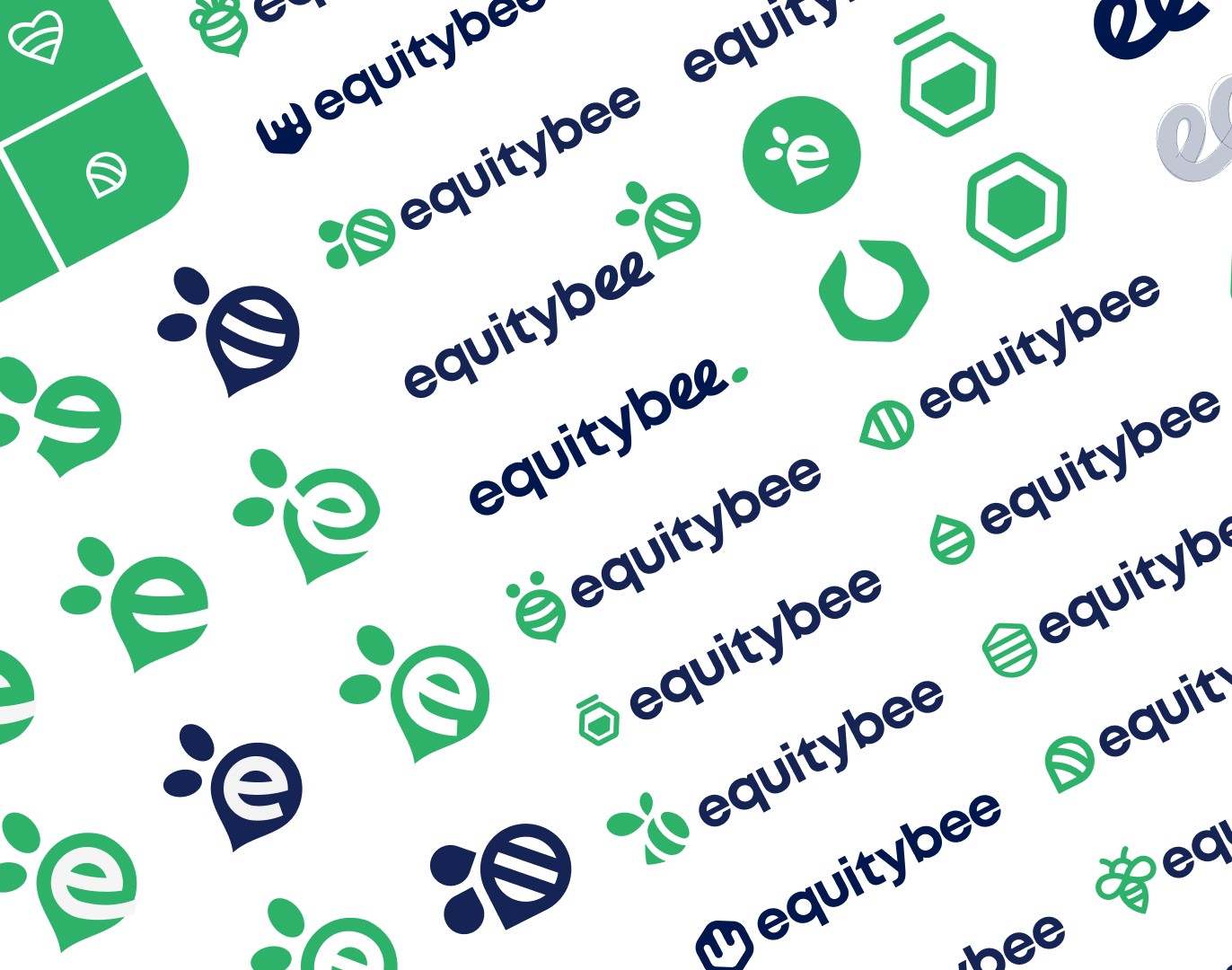
From bee to brand
The previous identity had structural problems that prevented it from functioning as a real brand system.
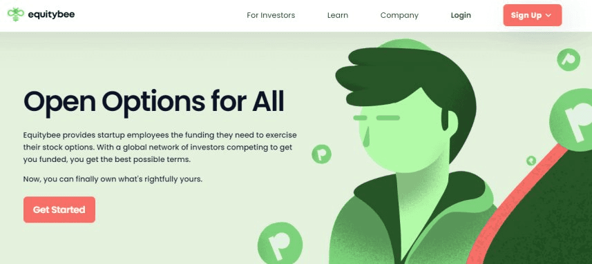
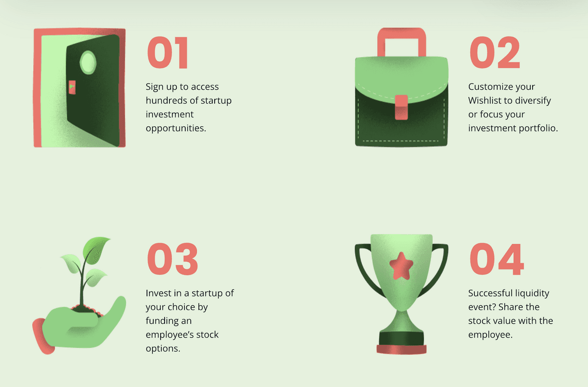
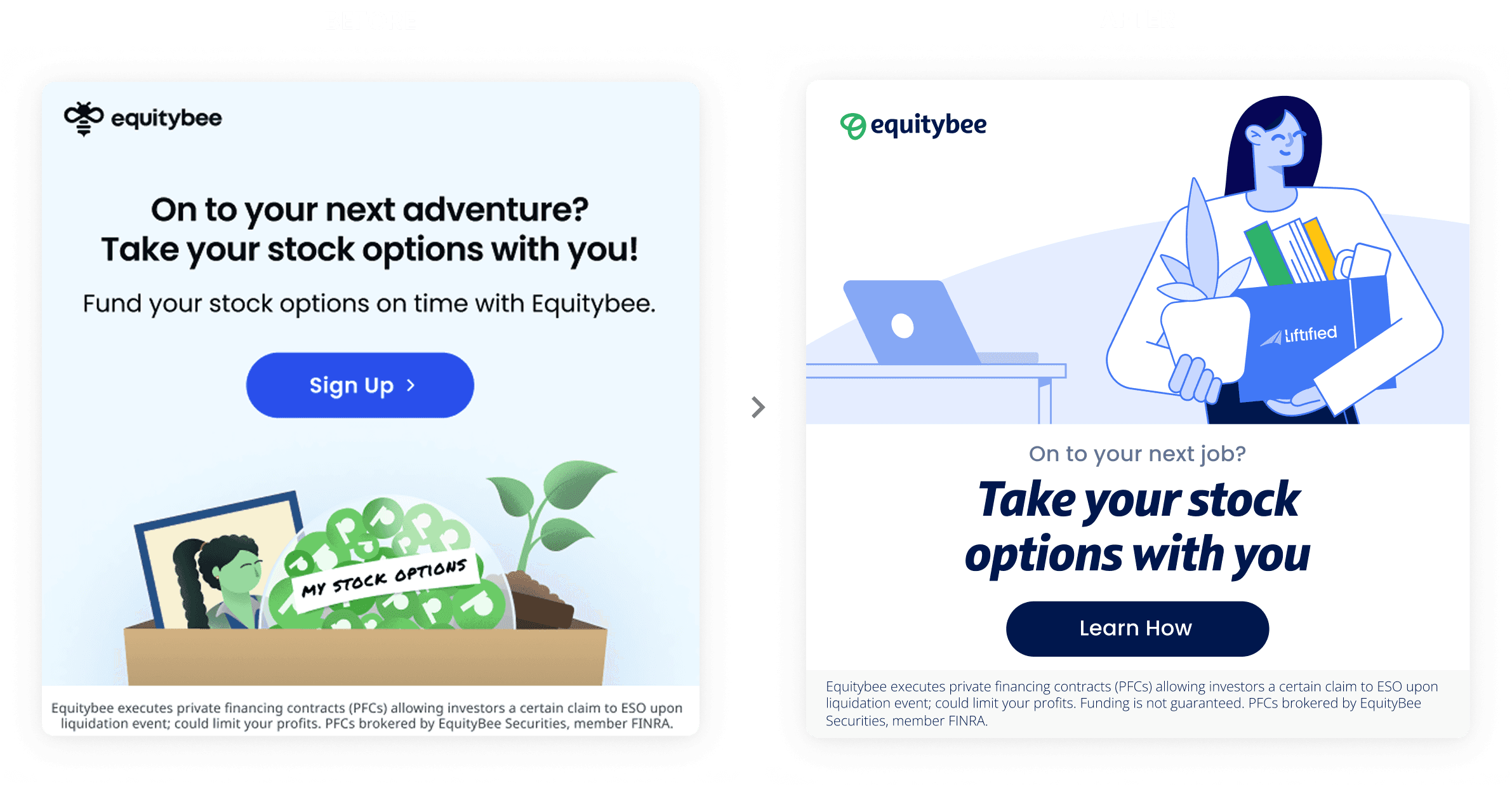
The color: Nearly neon, oversaturated. Text couldn't sit on it without losing legibility.
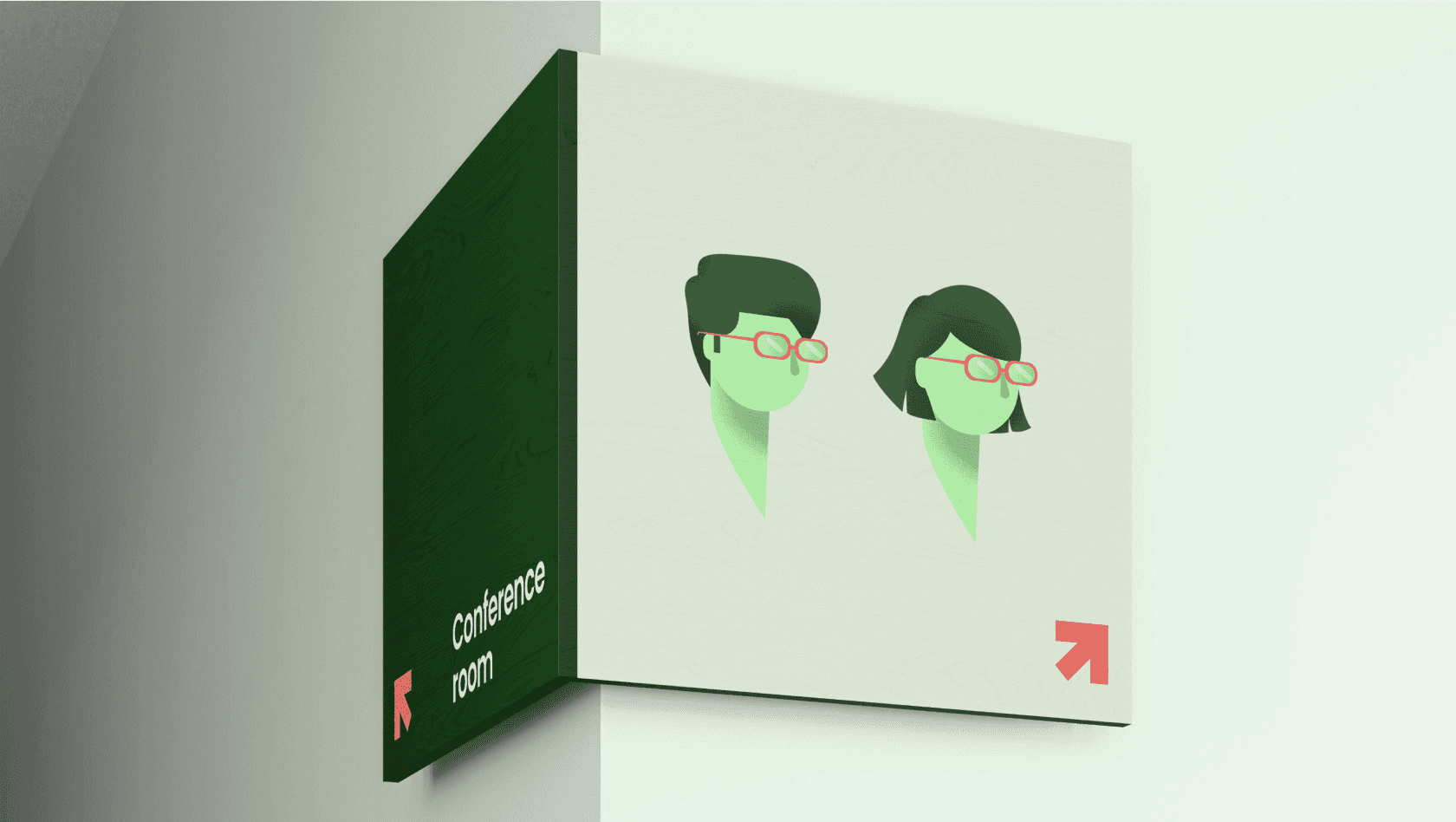
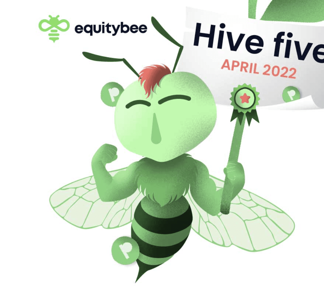
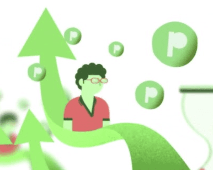
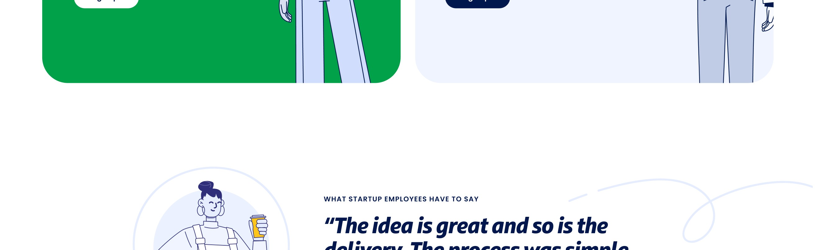
The characters: No hands. No legs. No expressions. They couldn't hold anything, point at anything, or show genuine emotion.
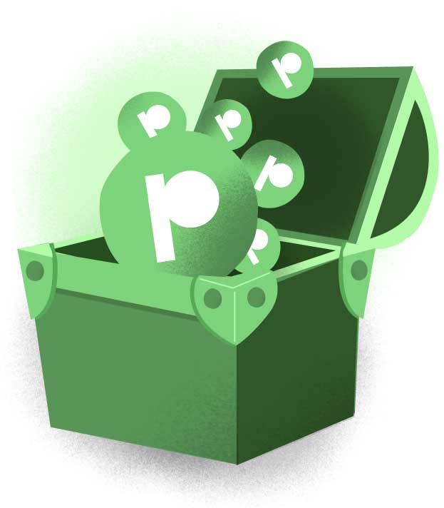
The floating icons: Green circles with a "P" inside, meant to represent stock options, except nobody understood that. What they actually saw was floating earbuds around people's heads that read as music.
No graphic language: Remove the characters from the frame and there's no brand left. Nothing that could stand alone and say Equitybee.
Old Brand

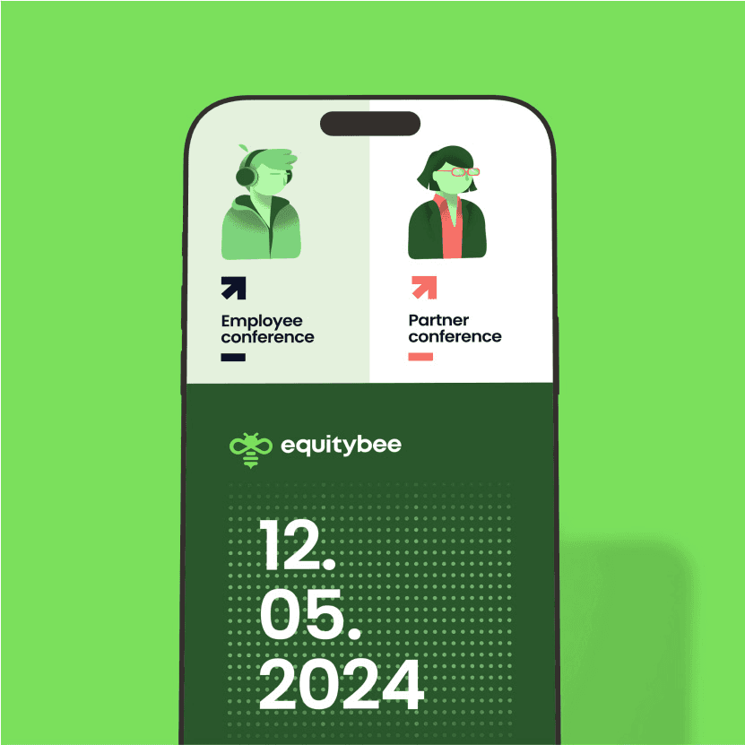






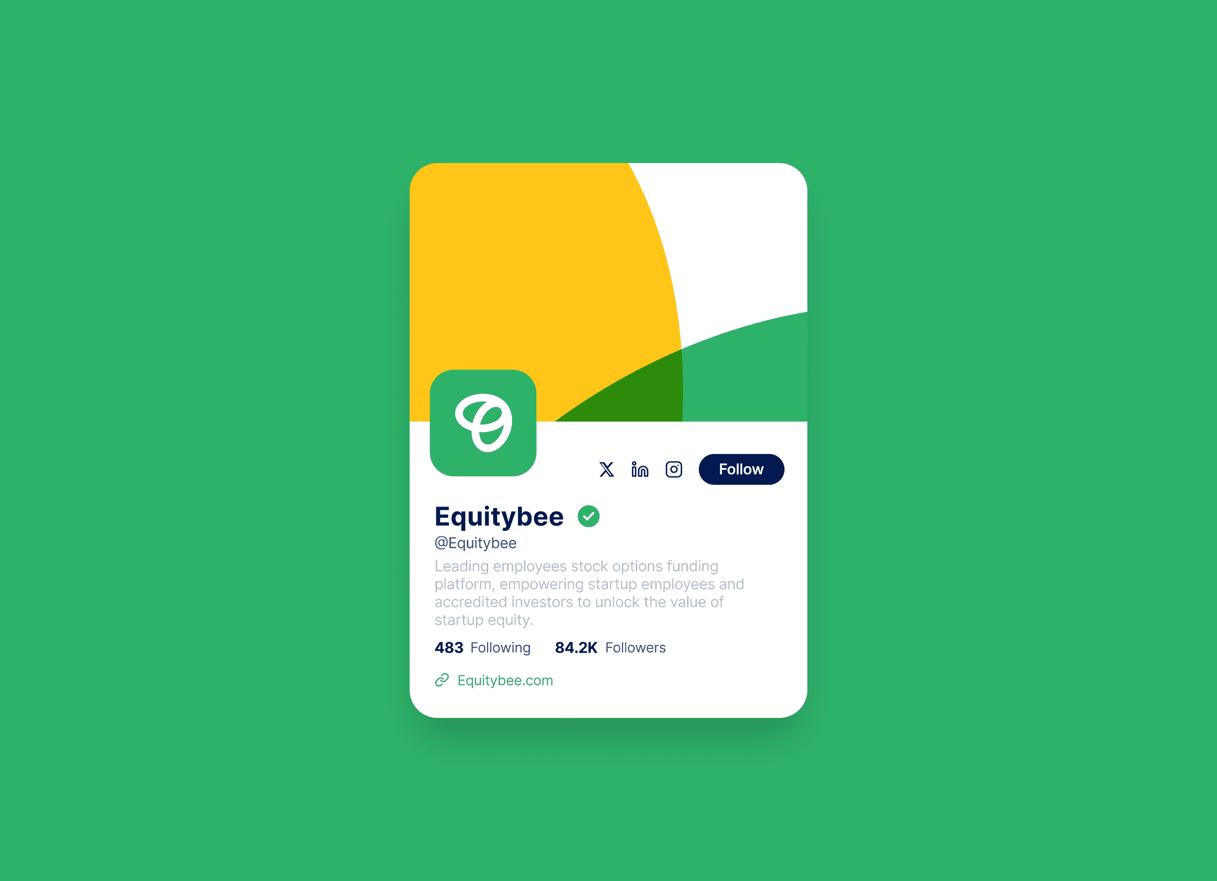
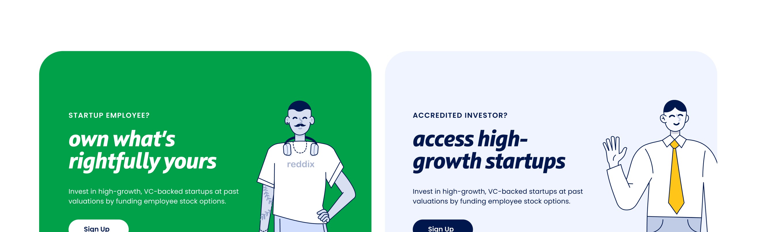
The answer wasn't two brands. It was one system with a calibrated dial. The illustration style, the color temperature, the type weight - everything was designed to shift along a spectrum: approachable and human for employees, clean and data-forward for investors. Same logo. Same palette. Different emphasis. The real design challenge was knowing exactly how far to push each direction without breaking the coherence of the whole.

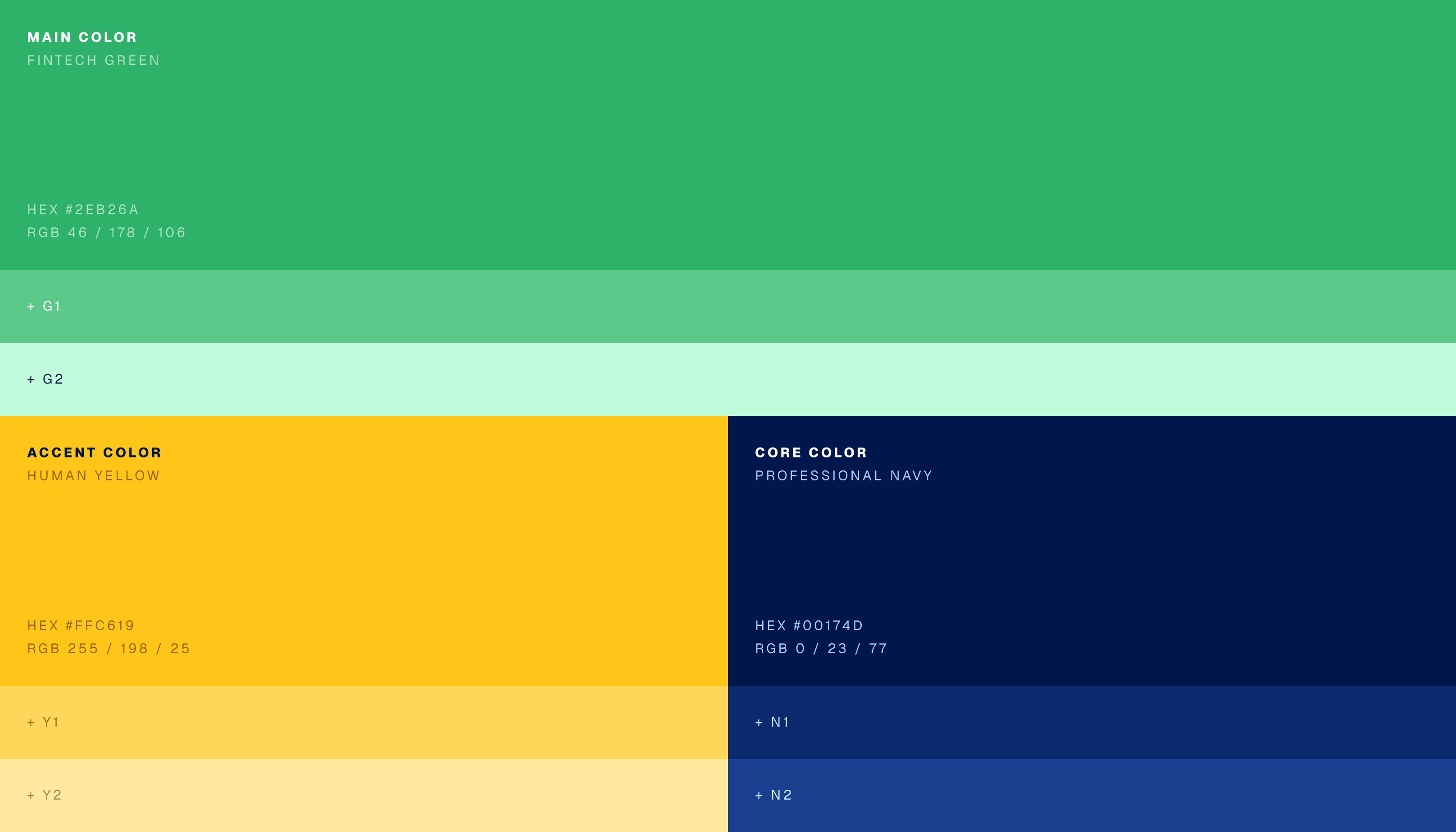
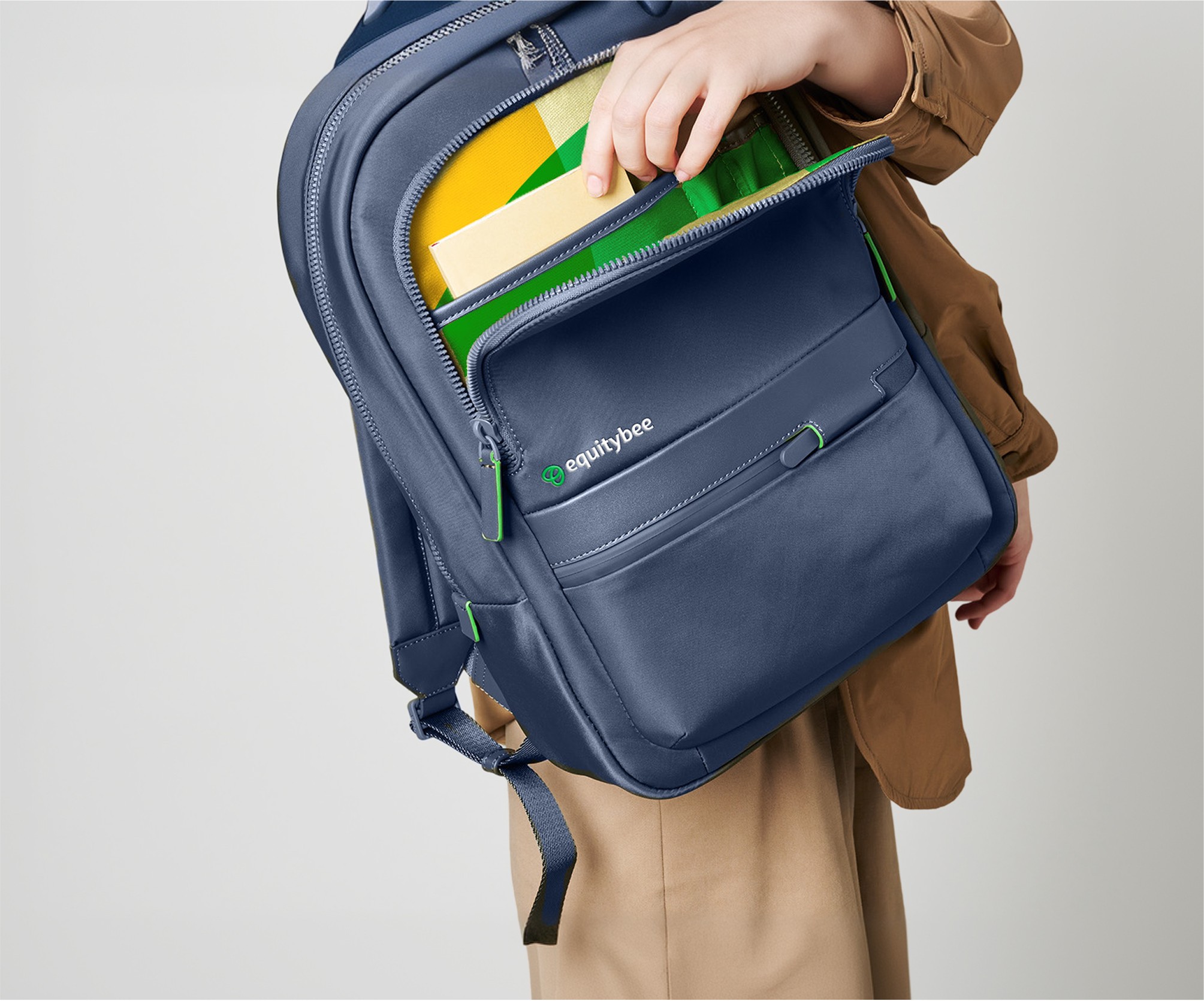
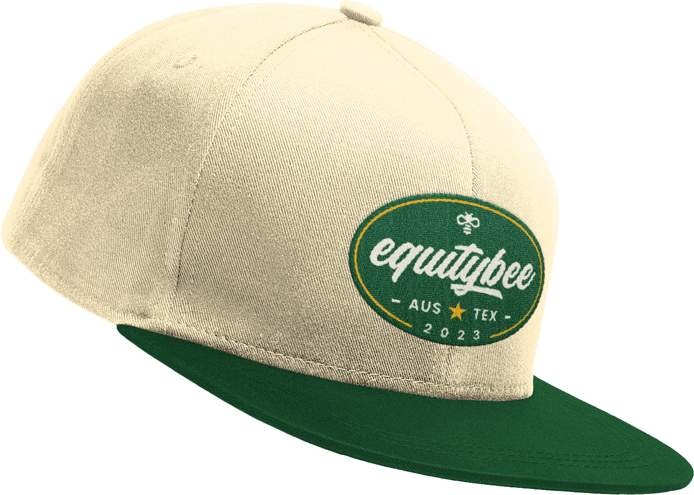
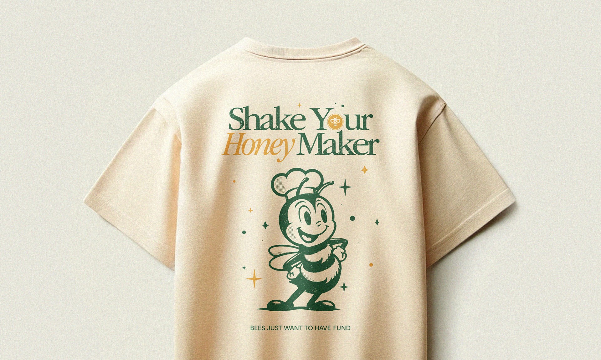
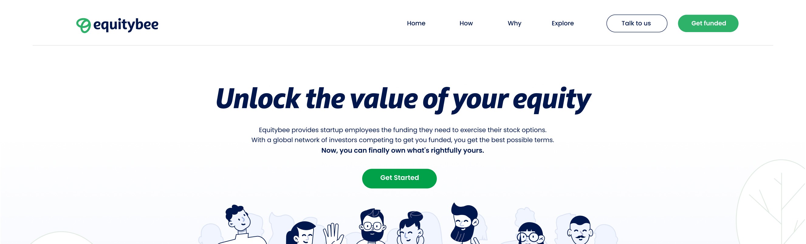
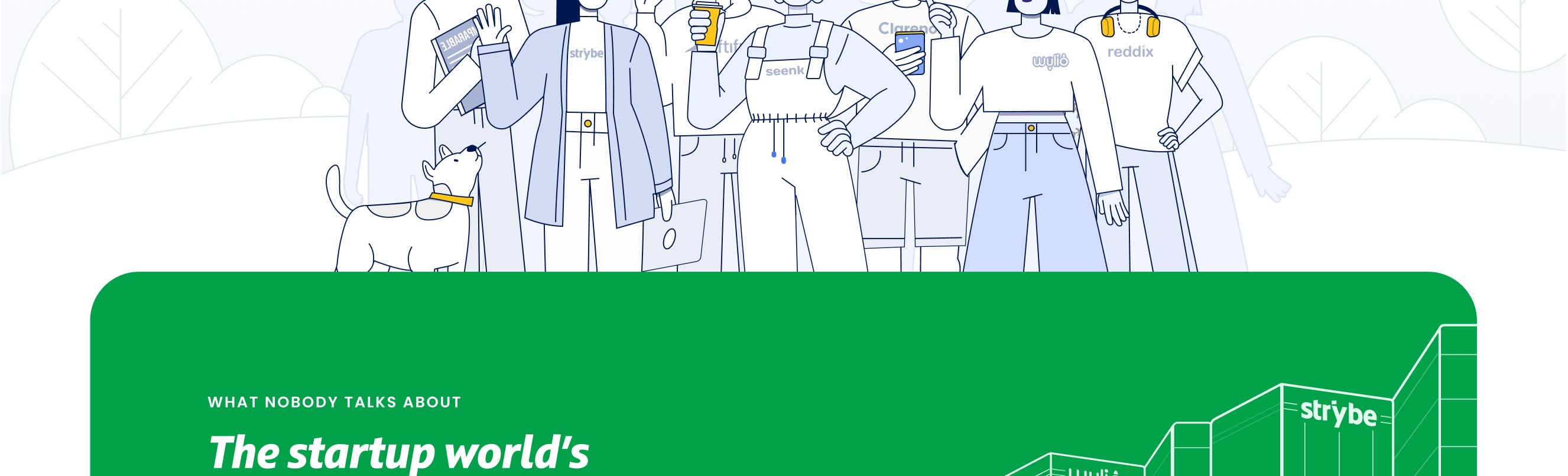
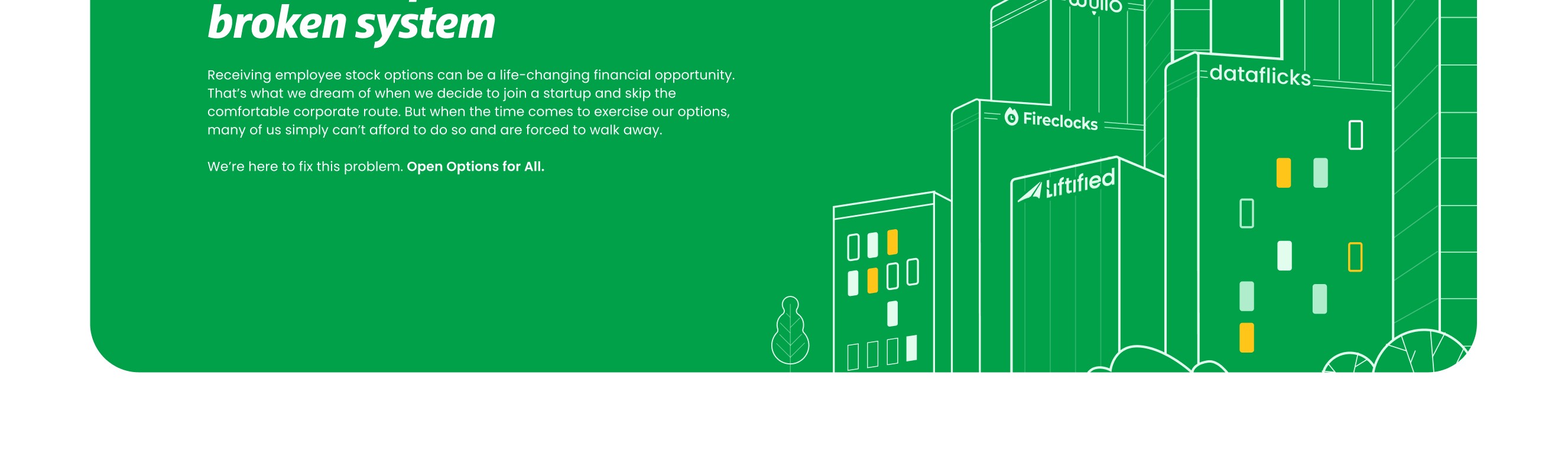
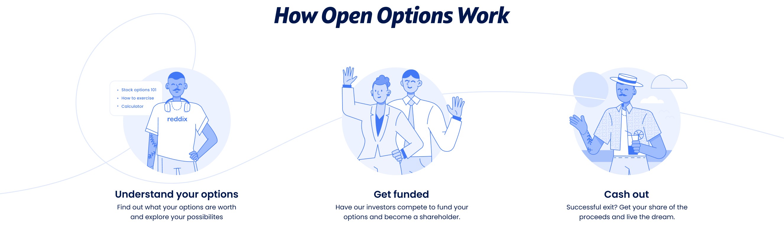
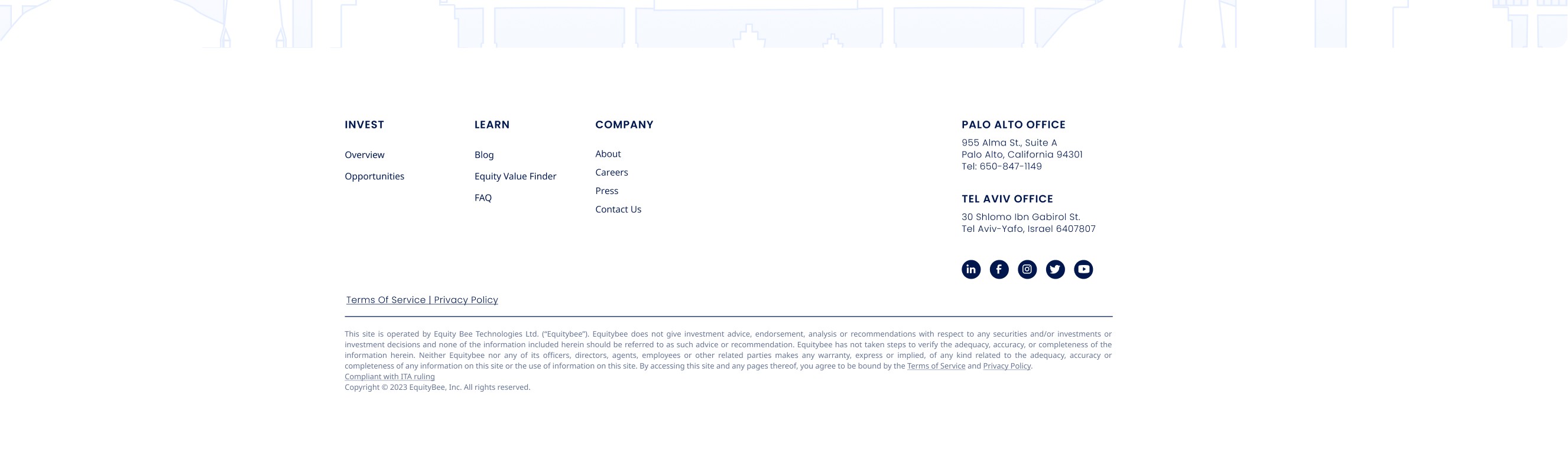
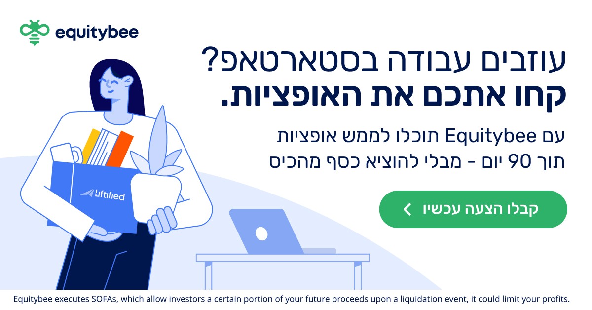
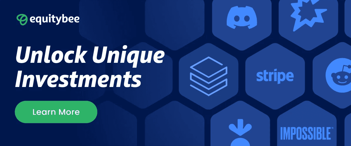
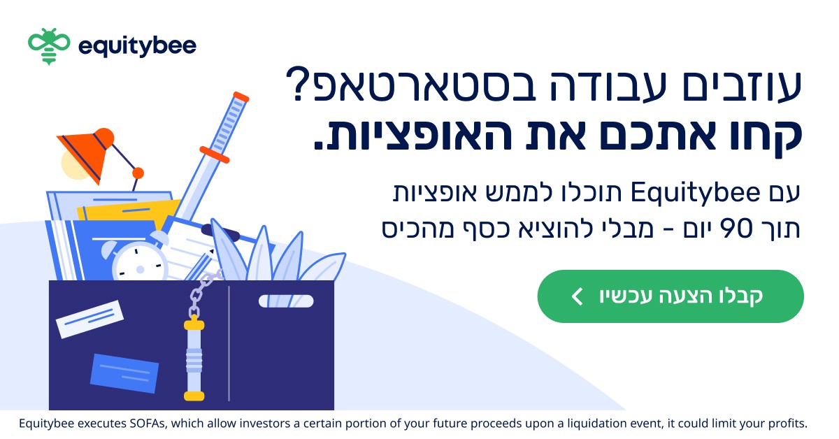
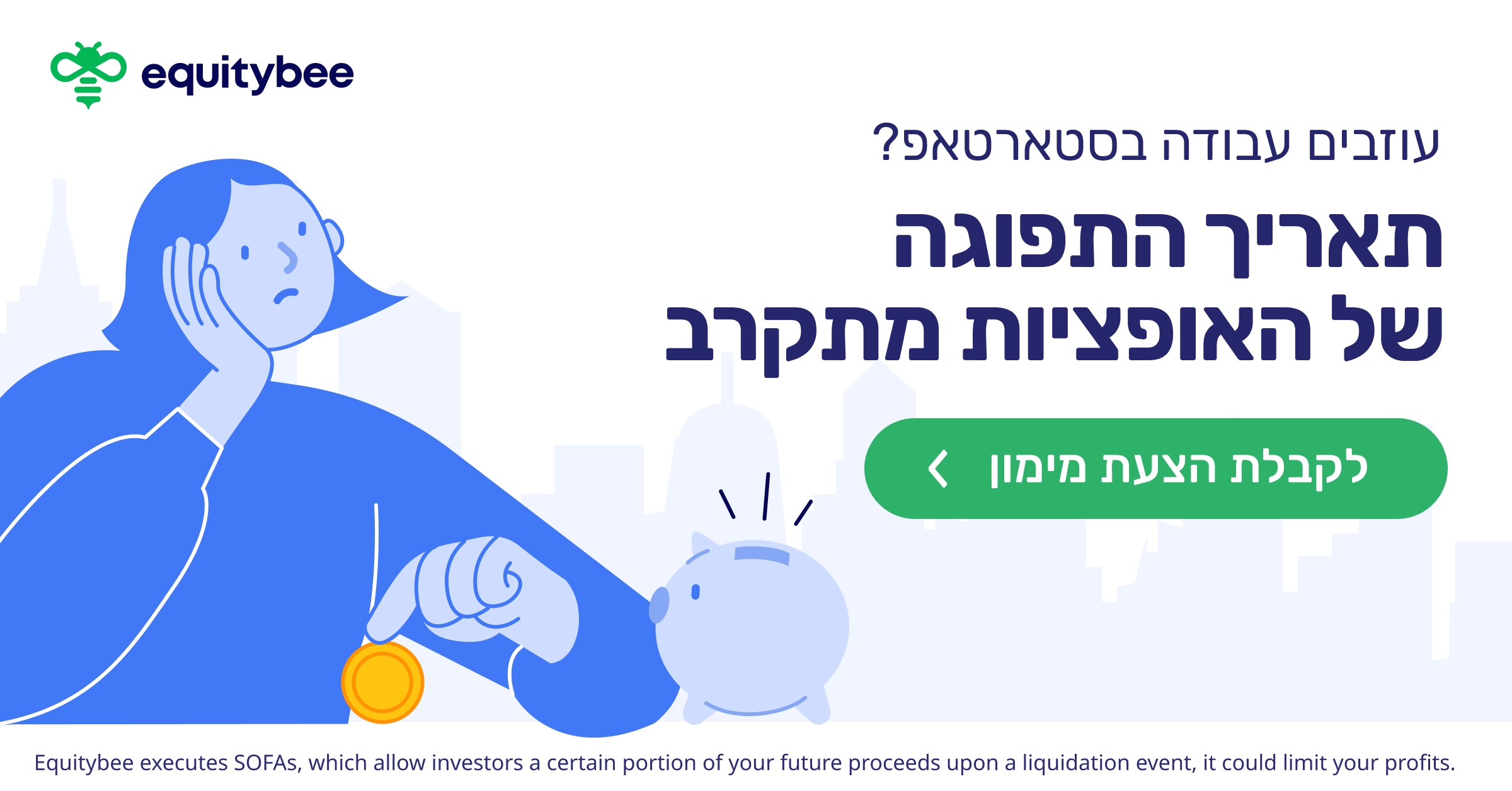
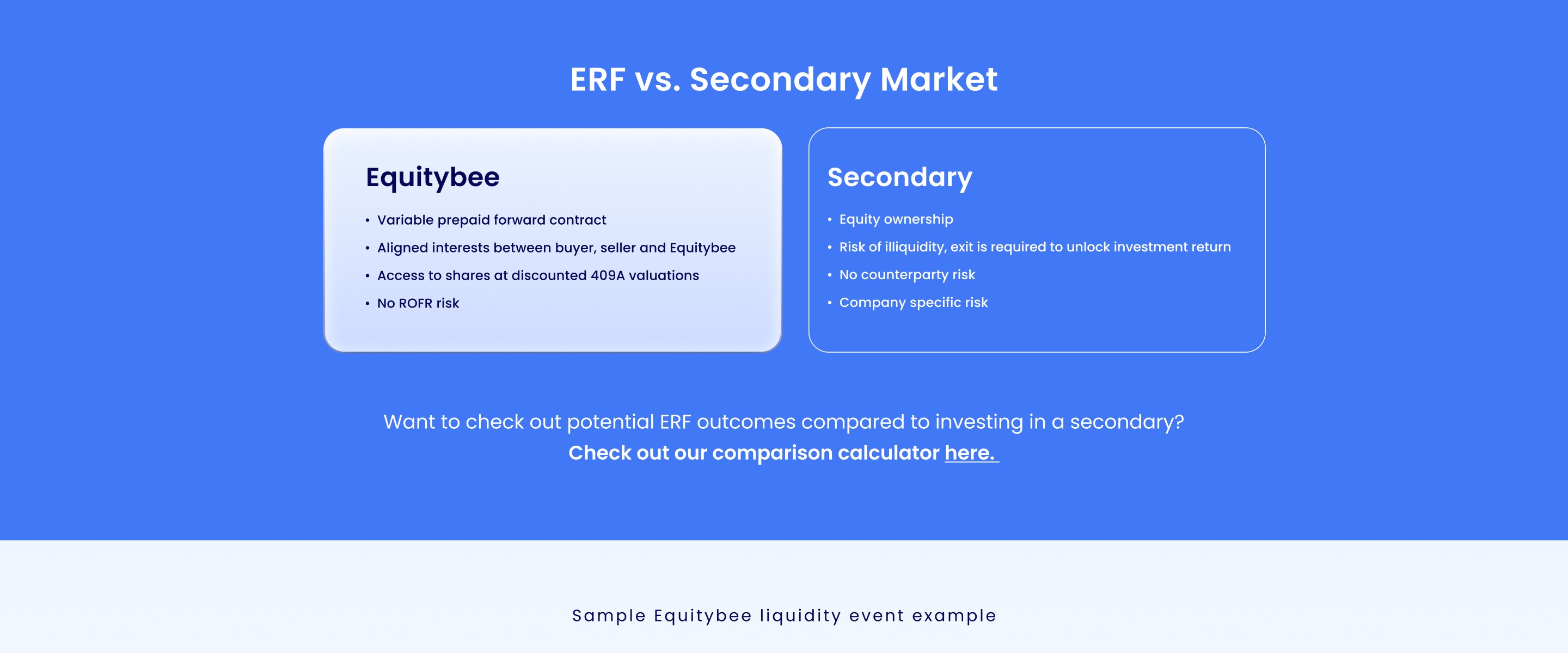
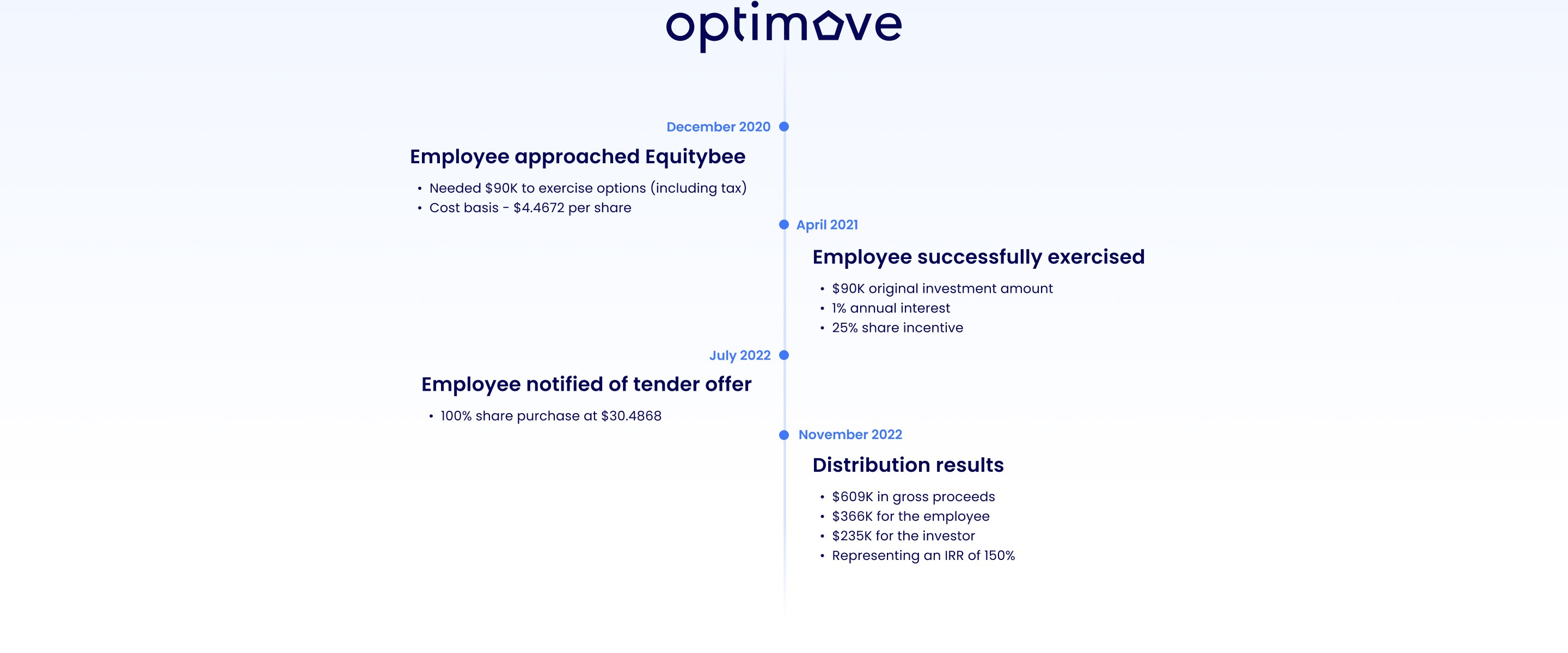
The redesign addressed all problems. A new logo built from the brand's core concept, two overlapping shapes representing employees and investors coming together. A richer color palette with a darker green anchored by a warm yellow. A new illustration system with full characters. And a modular graphic language of organic color merges, flexible enough to adapt to any context, consistent enough to always feel like Equitybee.
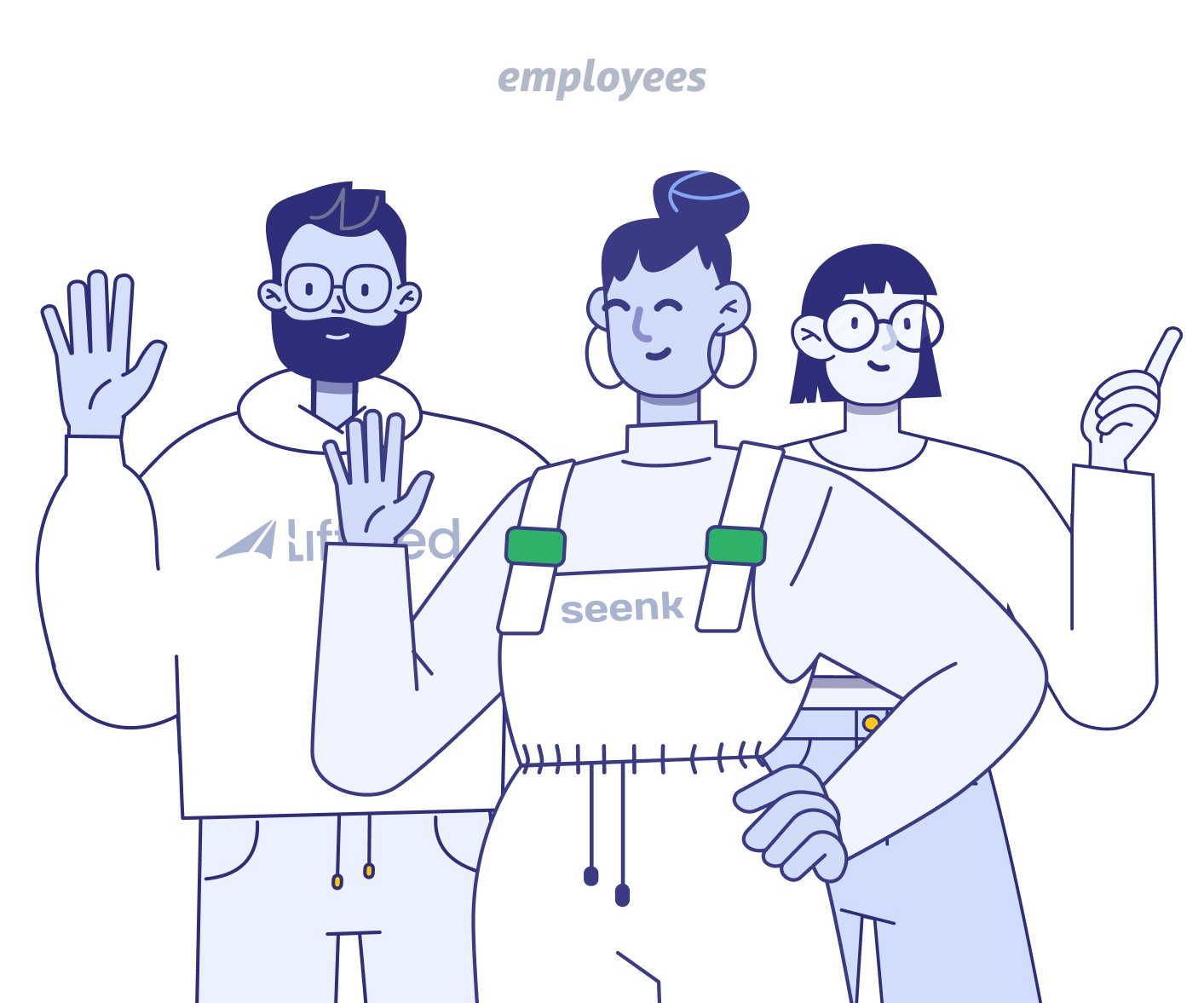
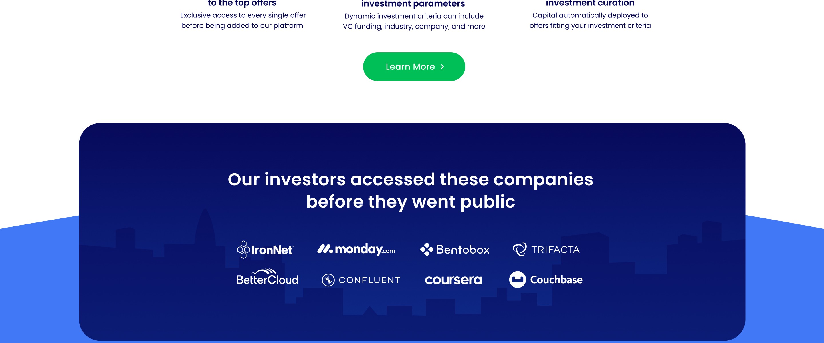
A custom illustration style built to humanize a complex financial product. Each character wears a lightly modified version of a real startup logo, close enough to be recognized by anyone who works there, different enough to avoid a lawsuit. The kind of detail that makes people tag their coworkers.





















Startup stock option financing platform
Equitybee
The Challenge
Equitybee served two very different audiences: startup employees seeking funding and accredited investors looking for access. The existing identity was recognizable but difficult to scale, relying heavily on neon green and a limited illustration system that struggled across different audiences, channels, and use cases.
The challenge was to create one brand that could feel approachable and human for employees, while remaining credible and structured for investors.
The Solution
We evolved Equitybee into a more flexible visual system built to work across both audiences. The rebrand introduced a new logo, broader color palette, typography system, expressive illustration language, and modular graphic elements based on overlapping forms.
The system was designed to adapt across web, campaigns, presentations, product touchpoints, and physical applications without losing a consistent Equitybee identity.
My Role
I led the hands-on design and execution of the rebrand in collaboration with the Head of Creative, developing the identity across logo, color, typography, illustration, and visual systems.
I also helped translate the new brand across the marketing website, campaigns, presentations, and product touchpoints, including co-designing and rebuilding the website in Webflow.
Deliverables:
Brand Identity
Visual System
Web Design
Illustration
Startup stock option financing platform
Equitybee
The Challenge
Equitybee served two very different audiences: startup employees seeking funding and accredited investors looking for access. The existing identity was recognizable but difficult to scale, relying heavily on neon green and a limited illustration system that struggled across different audiences, channels, and use cases.
The challenge was to create one brand that could feel approachable and human for employees, while remaining credible and structured for investors.
The Solution
We evolved Equitybee into a more flexible visual system built to work across both audiences. The rebrand introduced a new logo, broader color palette, typography system, expressive illustration language, and modular graphic elements based on overlapping forms.
The system was designed to adapt across web, campaigns, presentations, product touchpoints, and physical applications without losing a consistent Equitybee identity.
My Role
I led the hands-on design and execution of the rebrand in collaboration with the Head of Creative, developing the identity across logo, color, typography, illustration, and visual systems.
I also helped translate the new brand across the marketing website, campaigns, presentations, and product touchpoints, including co-designing and rebuilding the website in Webflow.
Deliverables:
Brand Identity
Visual System
Web Design
Illustration
Logotype Construction
Logotype Construction
Identity
From bee to brand
The previous identity had structural problems that prevented it from functioning as a real brand system.
The color: Nearly neon, oversaturated. Text couldn't sit on it without losing legibility.
The characters: No hands. No legs. No expressions. They couldn't hold anything, point at anything, or show genuine emotion.
The floating icons: Green circles with a "P" inside, meant to represent stock options, except nobody understood that. What they actually saw was floating earbuds around people's heads that read as music.
No graphic language: Remove the characters from the frame and there's no brand left. Nothing that could stand alone and say Equitybee.
Old Brand
The answer wasn't two brands. It was one system with a calibrated dial. The illustration style, the color temperature, the type weight - everything was designed to shift along a spectrum: approachable and human for employees, clean and data-forward for investors. Same logo. Same palette. Different emphasis. The real design challenge was knowing exactly how far to push each direction without breaking the coherence of the whole.
The redesign addressed all problems. A new logo built from the brand's core concept, two overlapping shapes representing employees and investors coming together. A richer color palette with a darker green anchored by a warm yellow. A new illustration system with full characters. And a modular graphic language of organic color merges, flexible enough to adapt to any context, consistent enough to always feel like Equitybee.
A custom illustration style built to humanize a complex financial product. Each character wears a lightly modified version of a real startup logo, close enough to be recognized by anyone who works there, different enough to avoid a lawsuit. The kind of detail that makes people tag their coworkers.