" transform="translate(9 9)" width="526.56px"/></svg>)
Italian Resturant Brand Refresh
Raffaello
The Challenge
Raffaello has been serving Italian food in Israel since 1993. Thirty years in, the brand had something most restaurants don't: genuine heritage. A loyal customer base. A logo that had held up over time.
What it didn't have was a visual language. The logo existed in isolation, no supporting system, no graphic vocabulary, nothing that could travel across packaging, print, or physical space with any consistency. Every touchpoint was its own one-off decision.
Deliverables:
Logo refinement
Brand Language
Packaging & collateral
Icons design


The Insight
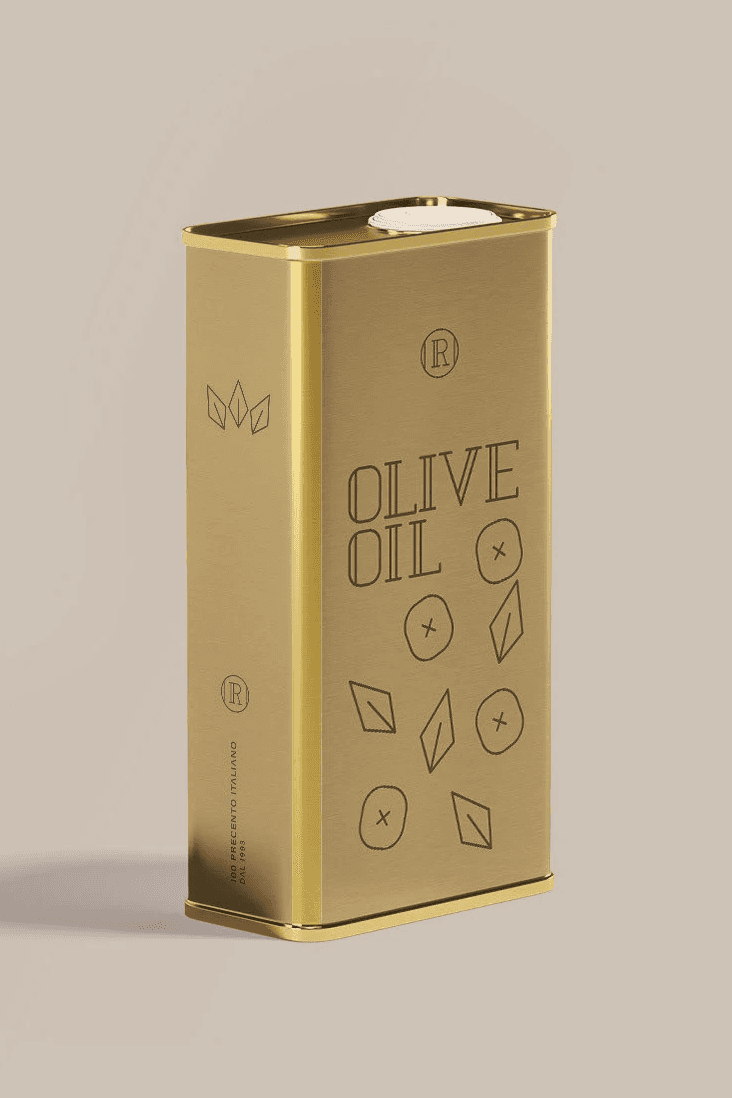
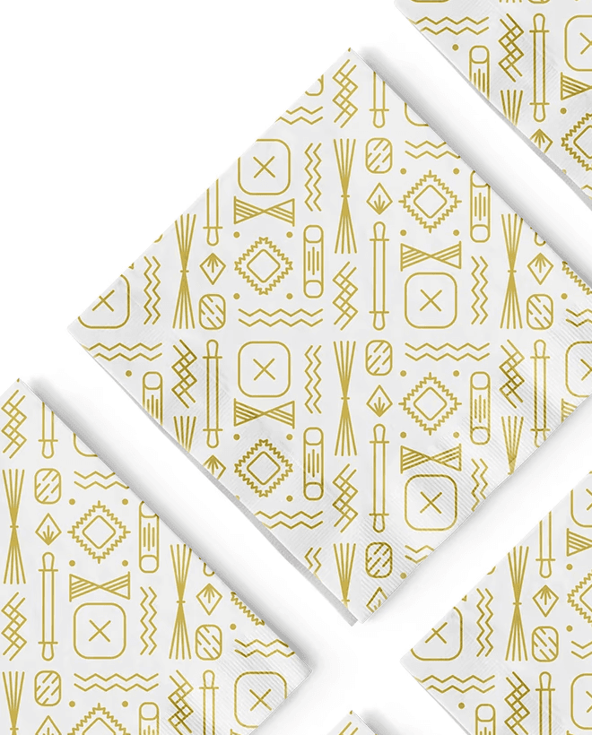
The new tagline said "100 Precento Italiano." The question was how to make that visible, not just in words, but in every surface the brand touched.
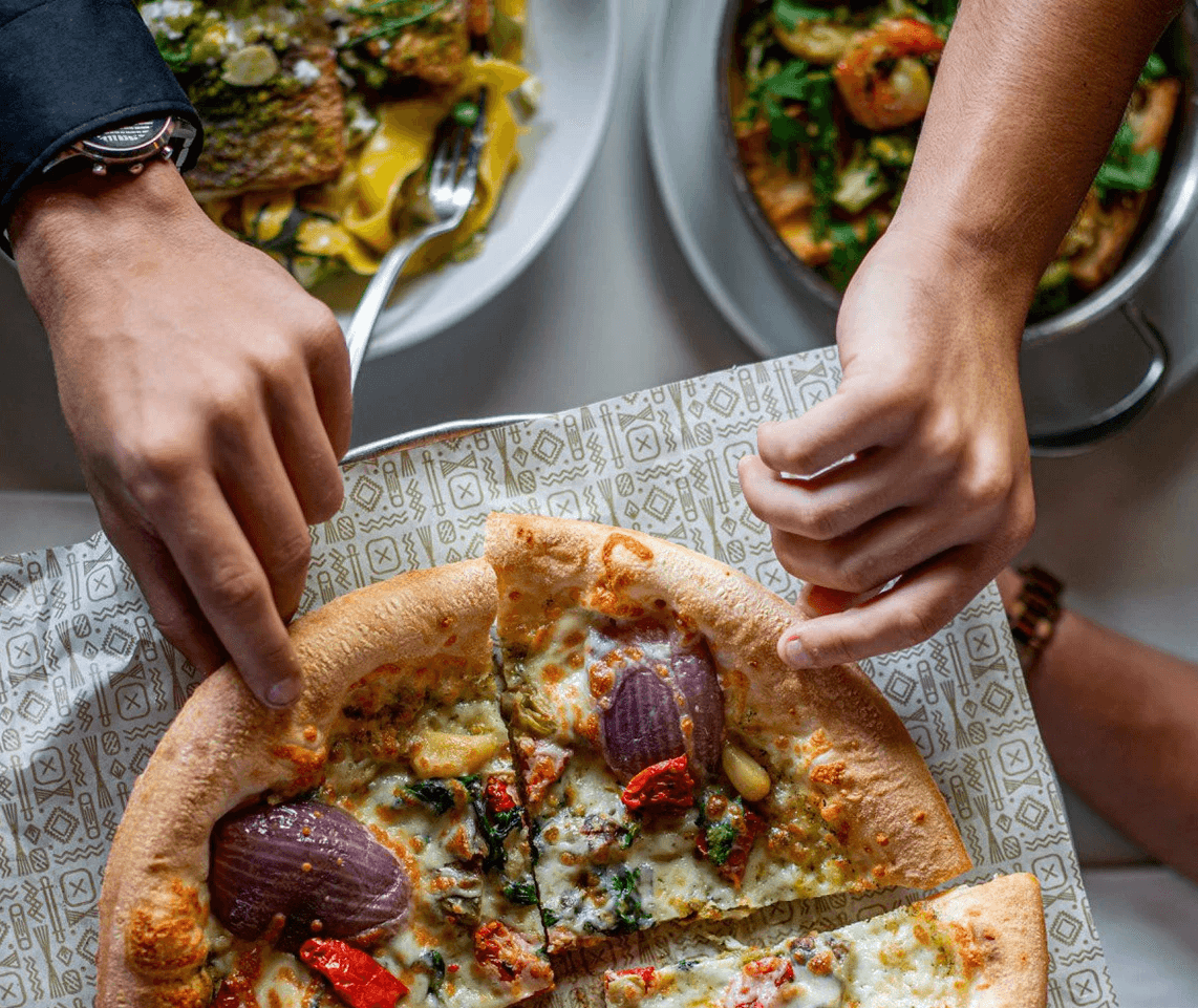
The answer came from the kitchen itself. Each icon in the system is drawn from the Italian culinary world: pasta shapes, ingredients, kitchen tools. Each one is constructed with the same geometric logic as the logotype - thin lines, precise angles, controlled weight. The icons don't just reference the food.